
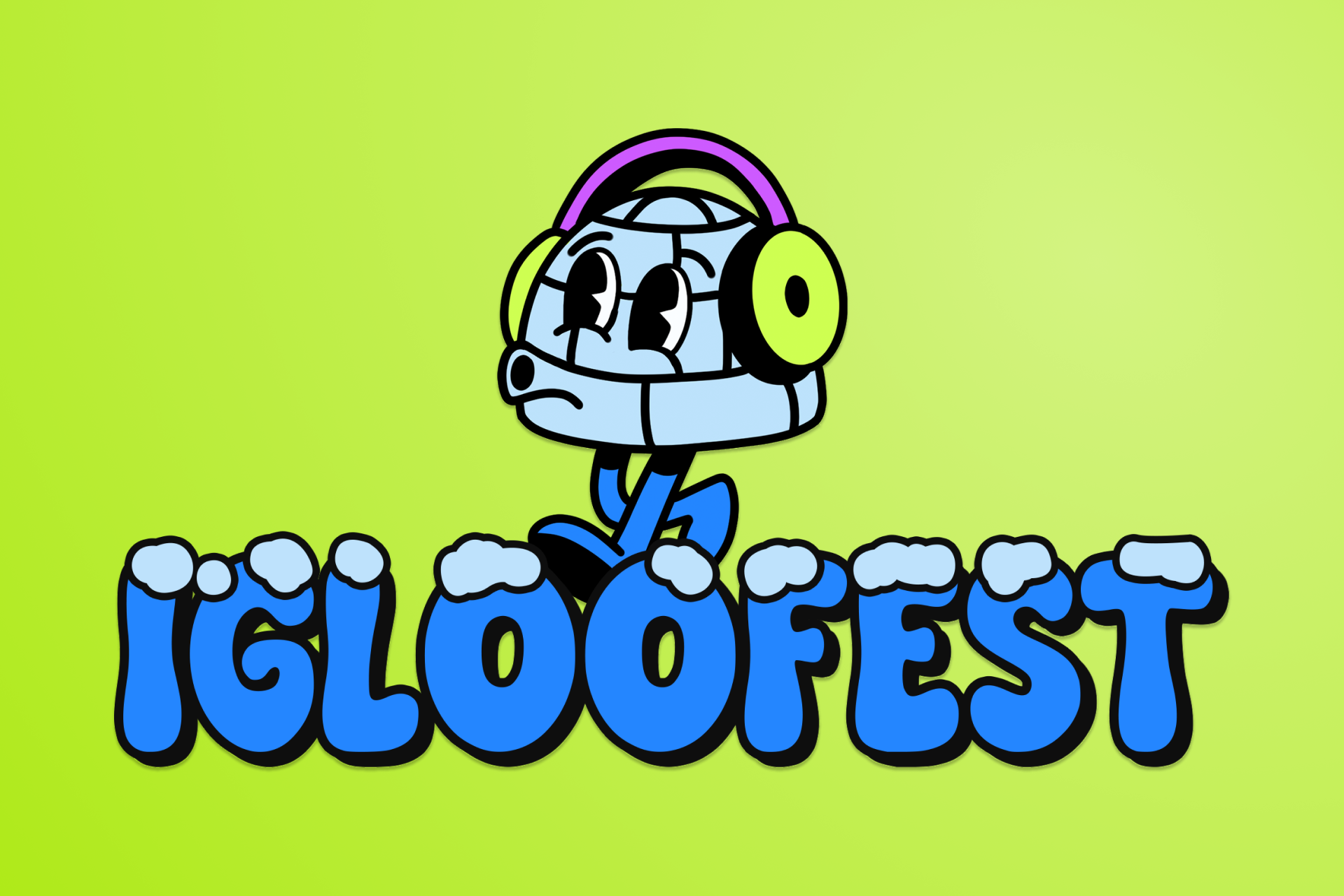
Reimagining Igloofest
A UX/UI and rebranding concept created during Humanithon 2025, an anti-AI hackathon focused on designing technology that feels intentional, human, and emotionally grounded. This project reimagines Igloofest’s digital presence by enhancing real-world experiences rather than competing with them.
Team Distribution
Laura: Team Lead, Brand Designer, Visual Direction, UX/UI Design & Strategy
Valeria: UX Research & Strategy
Tim : UX/UI Design & Prototyping
I led the design strategy, defined the core user problems, and translated research insights into product decisions across discovery, selection, and checkout. I was responsible for the mood board, color palette, typography, layout consistency, accessibility considerations, wireframes, and high-fidelity UI, while coordinating the team throughout the hackathon.
Project Overview
This conceptual project explores a rebranding and UX/UI redesign for Igloofest, Montréal’s iconic winter music festival. The goal was to create a digital experience that supports festival-goers in high-energy, real-world conditions cold temperatures, crowds, movement while staying true to Igloofest’s playful and expressive identity.
Designed in 48 hours as part of Humanithon 2025, the experience prioritizes clarity, accessibility, and emotion, proving that thoughtful design doesn’t need AI to feel intelligent.
Designed in 48 hours as part of Humanithon 2025, the experience prioritizes clarity, accessibility, and emotion, proving that thoughtful design doesn’t need AI to feel intelligent.
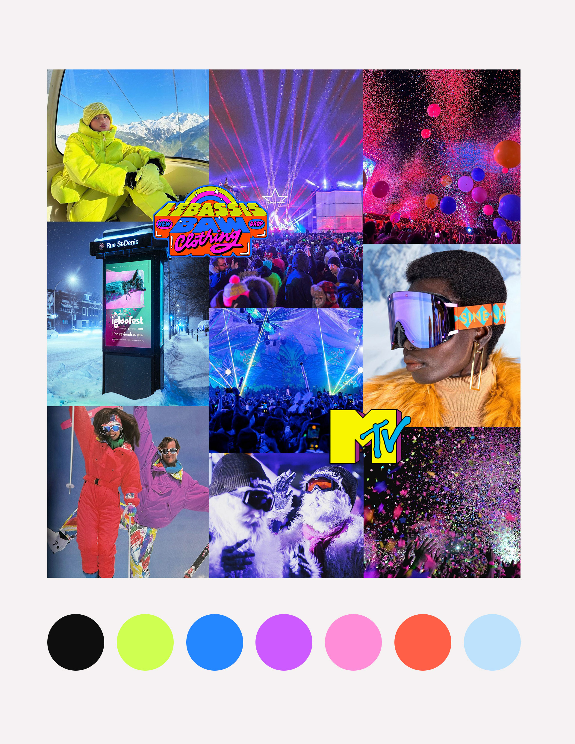
Visual Direction
TThe visual direction draws from cold, snowy night festival energy, inspired by neo-brutalism, 80s winter suits, and colorful stage lighting. Vibrant, high-contrast colors are paired with bold layouts to reflect Igloofest’s playful yet energetic personality while keeping the interface clear and accessible.
To bring the brand to life, I designed a custom Igloofest mascot in a short amount of time, inspired by an igloo form and winter gear. The mascot wears ear warmers that double as headphones, blending warmth, music, and personality into a single, friendly character. Its retro, slightly quirky look adds a human touch to the experience, making the brand feel more approachable, memorable, and unique across the interface.
To bring the brand to life, I designed a custom Igloofest mascot in a short amount of time, inspired by an igloo form and winter gear. The mascot wears ear warmers that double as headphones, blending warmth, music, and personality into a single, friendly character. Its retro, slightly quirky look adds a human touch to the experience, making the brand feel more approachable, memorable, and unique across the interface.
UX Approach & Key Decisions
Based on our user persona and research insights, we created an affinity map to identify key pain points and opportunities across the festival journey. This helped us prioritize clarity, reduce cognitive load, and guide our main UX decisions throughout the design.
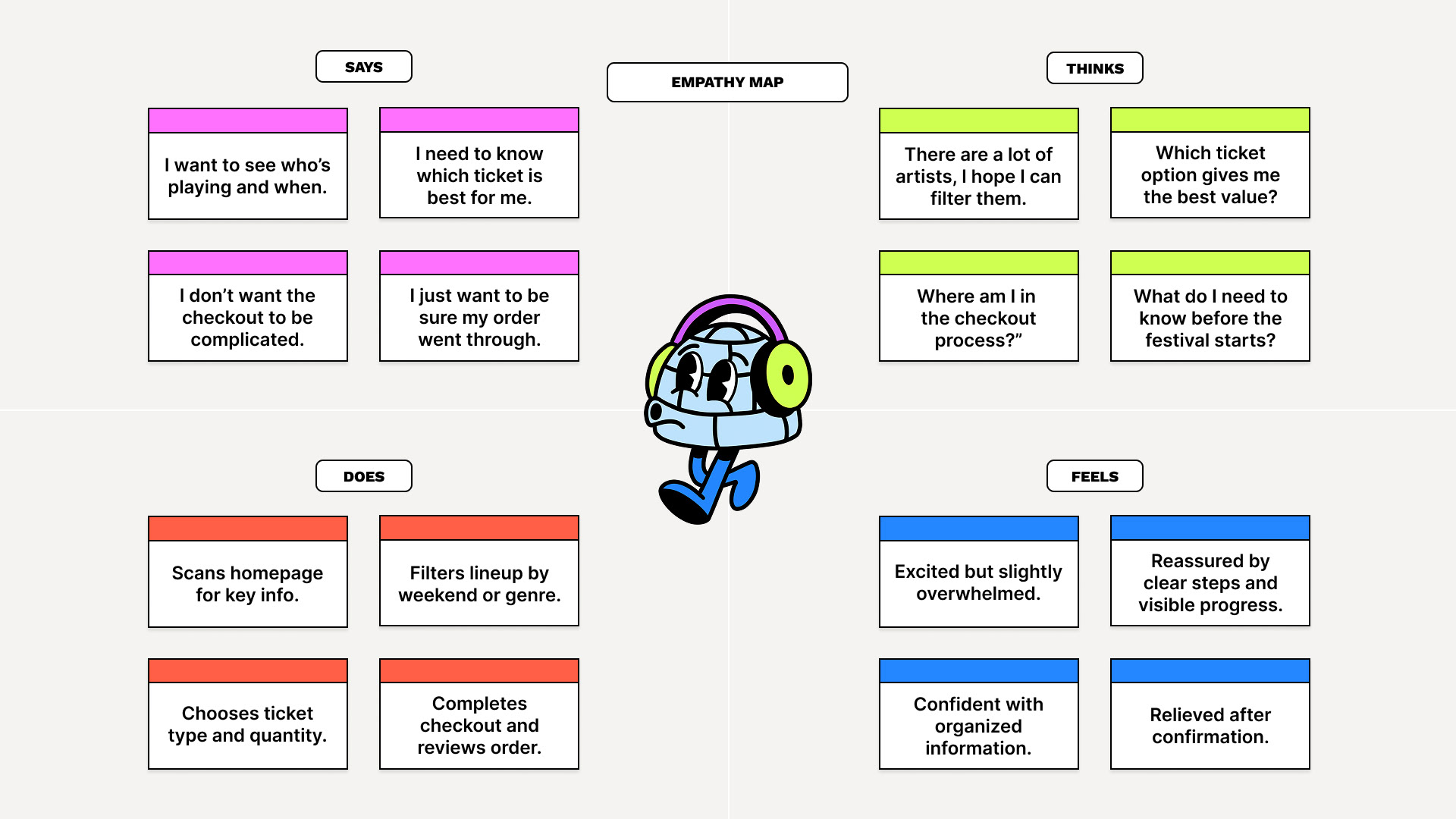
Empathy Map
This empathy map helped us understand users’ emotions and behaviors throughout the festival journey, especially moments of excitement mixed with overwhelm.
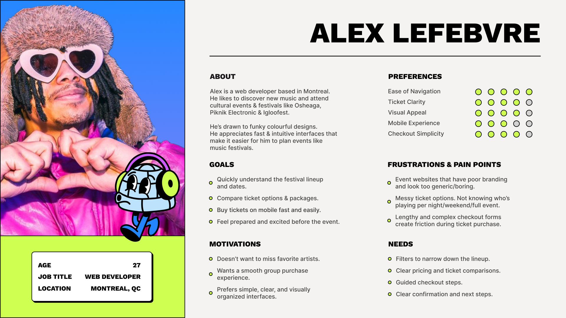
Persona
Defining a primary persona helped us stay focused on real festival-goers and design for clarity in high-energy, real-world conditions. It ensured that every UX decision from filtering the lineup to structuring the checkout prioritized reduced cognitive load, clear progression, and confidence at each step of the journey.
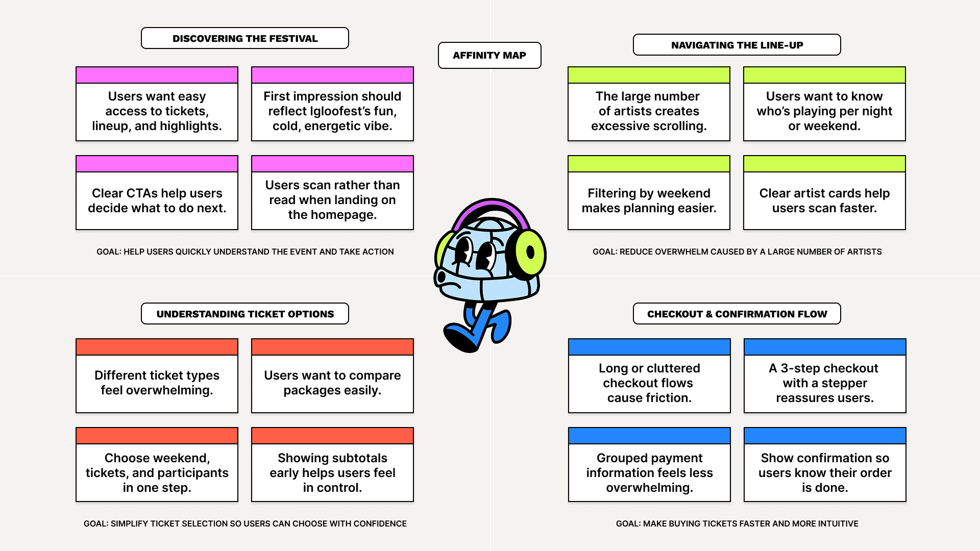
Affinity Map
We used an affinity map to group key user pain points and behaviors, allowing us to prioritize clarity, navigation, and confidence throughout the Igloofest experience.
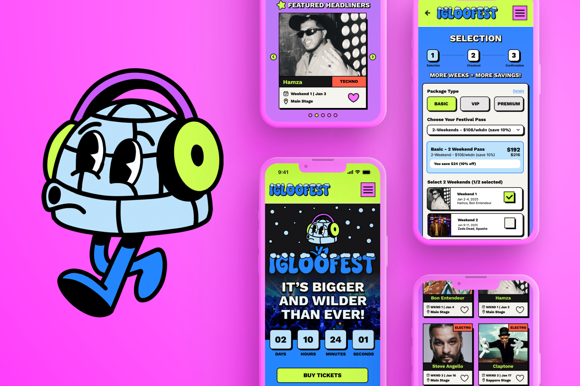
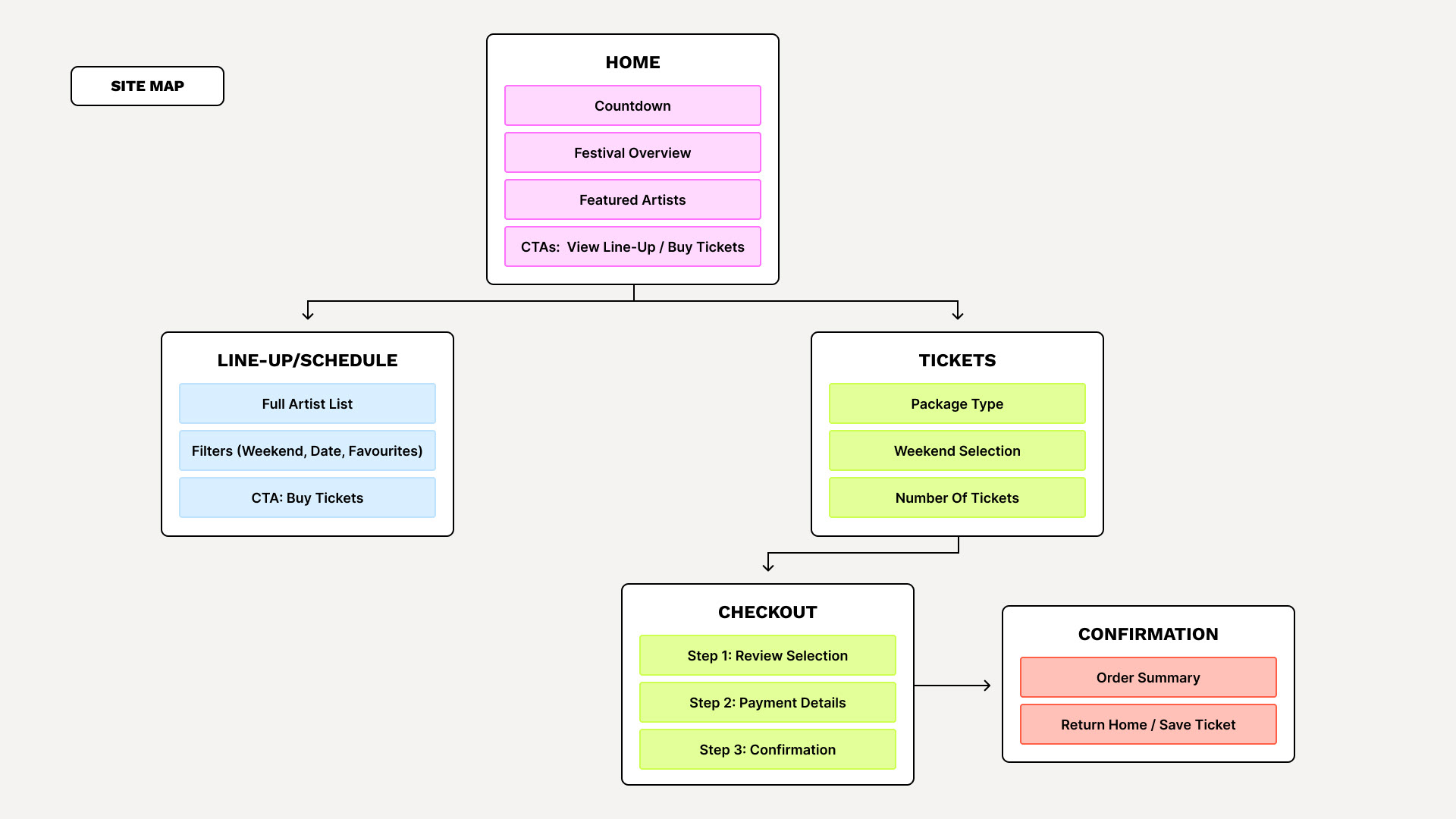
Site Map
As part of the Humanithon challenge, we were asked to design five core screens that represent the most important moments of the user journey. Based on our research and affinity mapping, we focused on the primary path festival-goers follow, from discovery to ticket purchase and confirmation.
Presentation
We created a short video to showcase our Igloofest redesign, highlighting the user journey, visual identity, and UX/UI decisions made during the 48-hour Humanithon hackathon.
Like what you see? Let’s collaborate!