
Context
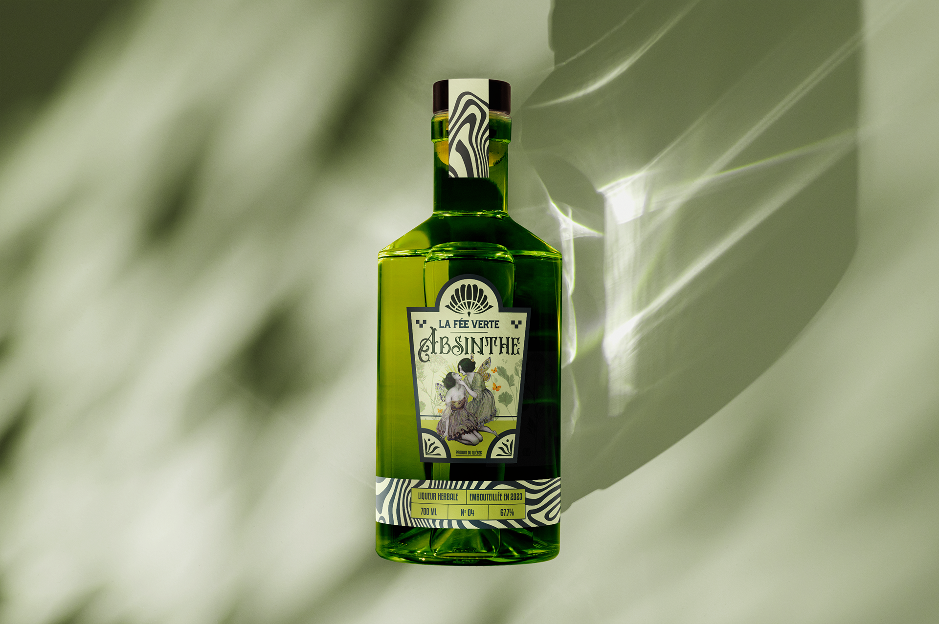
La Fée Verte is a fictional brand for an Absinthe bottle package design that would unleash the true essence of this mythic spirit.
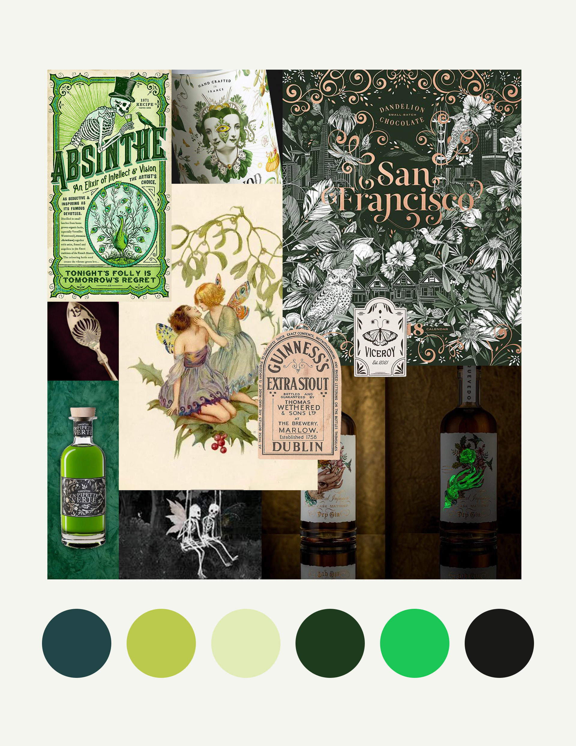
Moodboard & Inspiration
This conceptual packaging design was created for a fictional absinthe spirit bottle. Absinthe is made from wormwood plants and was also called "green fairy" and was believed to make people go insane (hallucinations, mania and psychosis). Absinthe was even banned in 1912 because it was believed to be dangerous. There was also a cocktail called Death in the Afternoon invented by Ernest Hemingway made up with champagne in absinthe.
Design Exploration
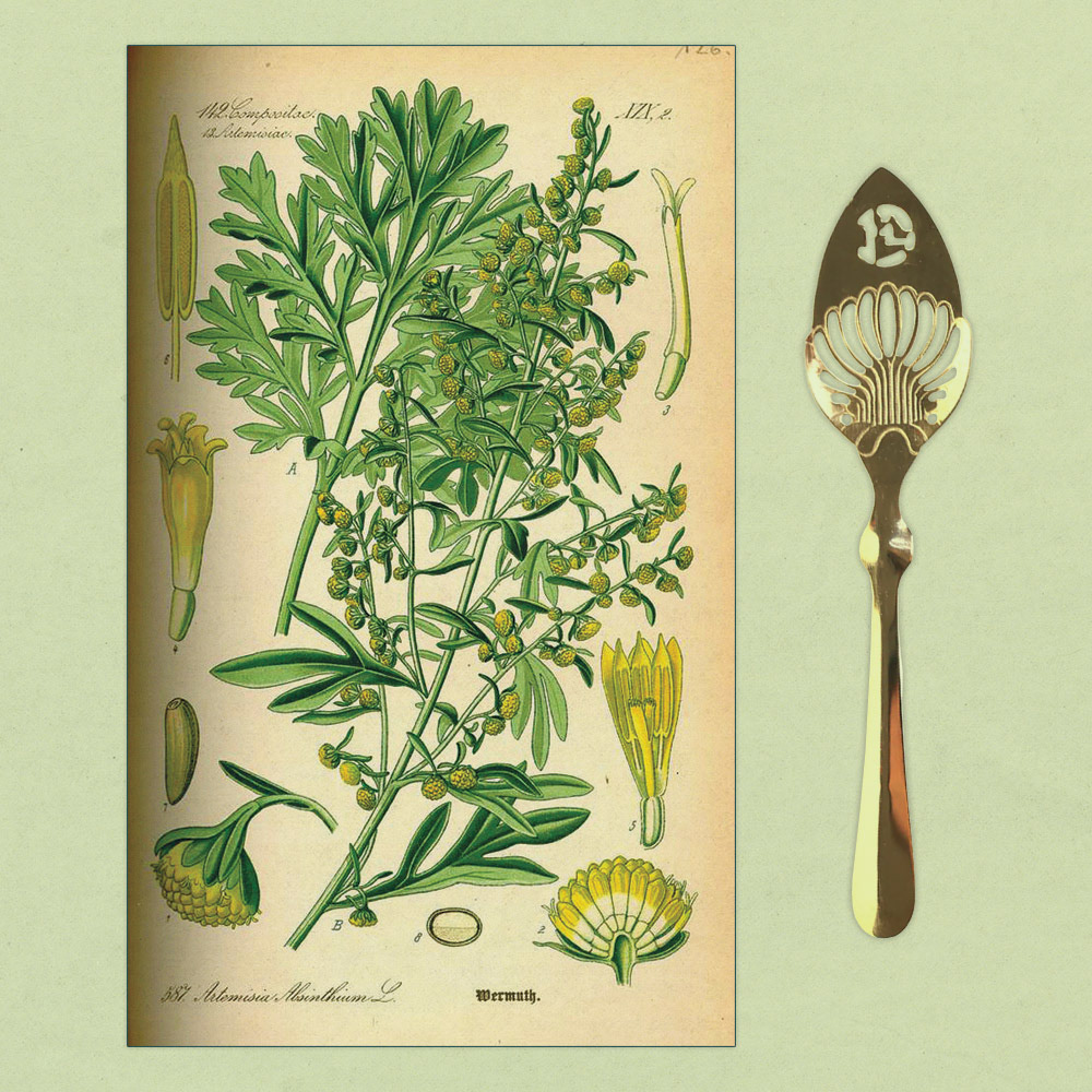
In the conceptualizing phase of this packaging design, the visual inspiration is rooted in several key elements. Victorian aesthetics, with intricate details reminiscent of 19th-century absinthe culture, form the foundation of the design. The duality of absinthe, with its enchanting yet eerie reputation, is captured through a careful balance of visuals. Absinthe drinking rituals, such as the use of sugar cubes and ornate spoons, are subtly integrated, paying homage to the traditional experience of enjoying the spirit. Finally, phosphorescent elements are used to evoke the idea of transformation and hallucination, reflecting the mystical and enigmatic qualities that have surrounded absinthe throughout its history. These sketches aim to blend tradition with innovation, setting the stage for a captivating and immersive packaging design.
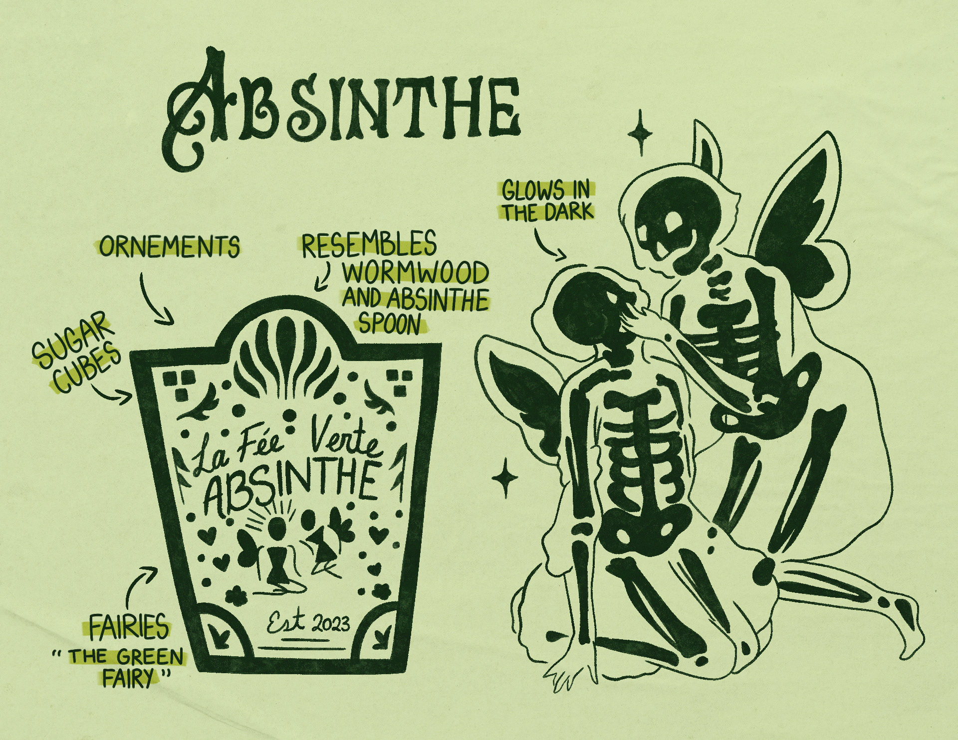
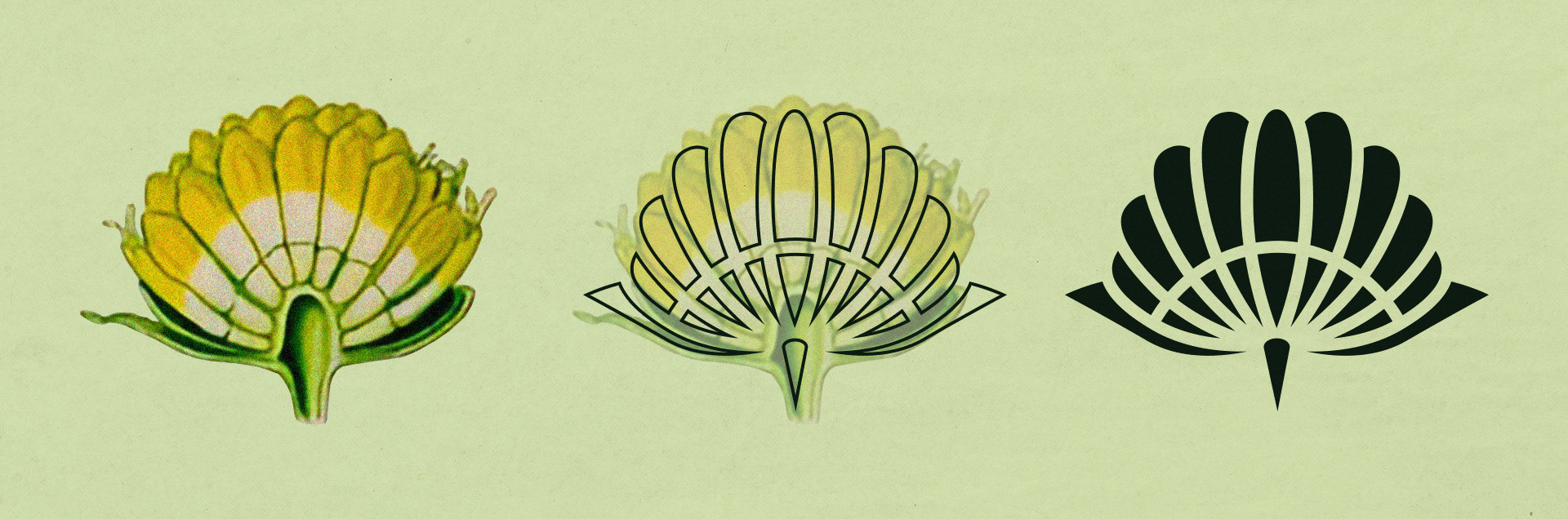
Ornamental Accents & Symbolism
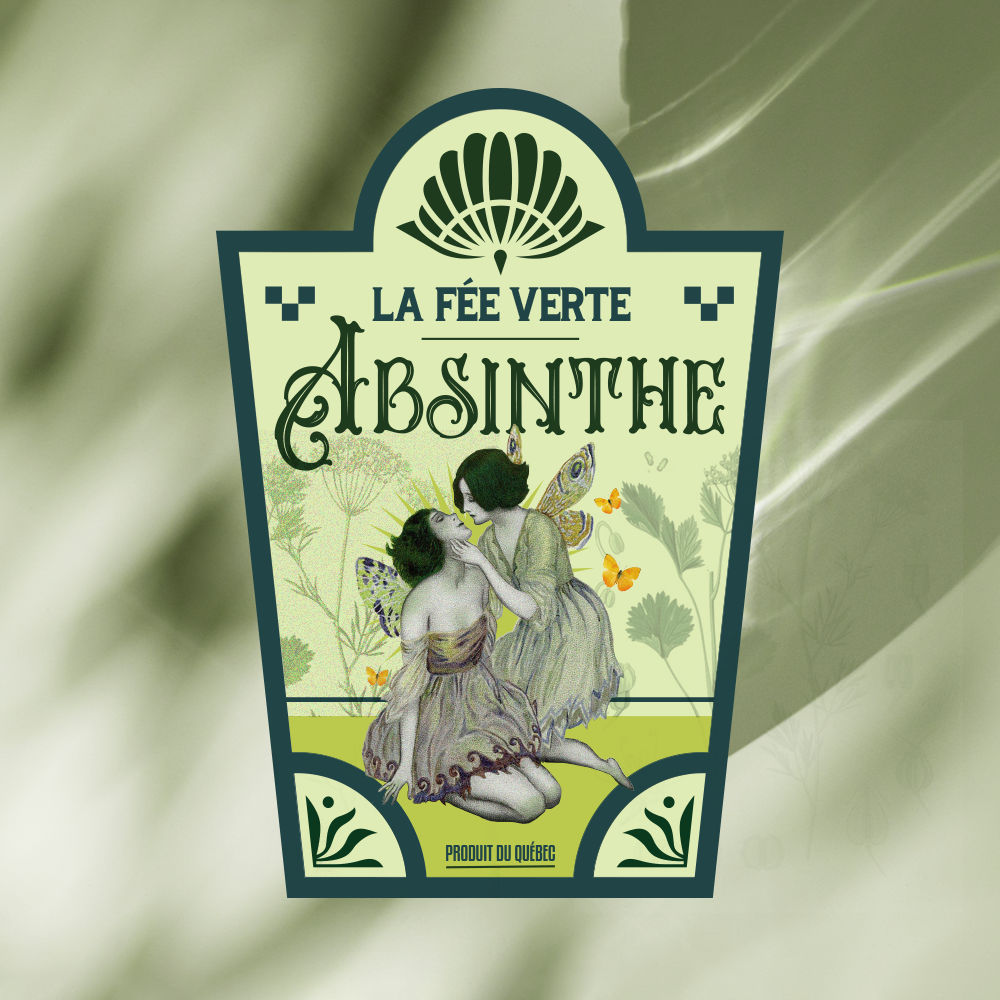
Ornamental accents and symbolism further enrich the design. The label’s top ornamentation draws inspiration from the anis plant, a key ingredient in absinthe, and mirrors the filigree patterns found in traditional absinthe spoons. The inclusion of squares resembling sugar cubes nods to the famous ritual where sugar cubes are dissolved into the spirit. These elements help connect the design to the rich history of absinthe.
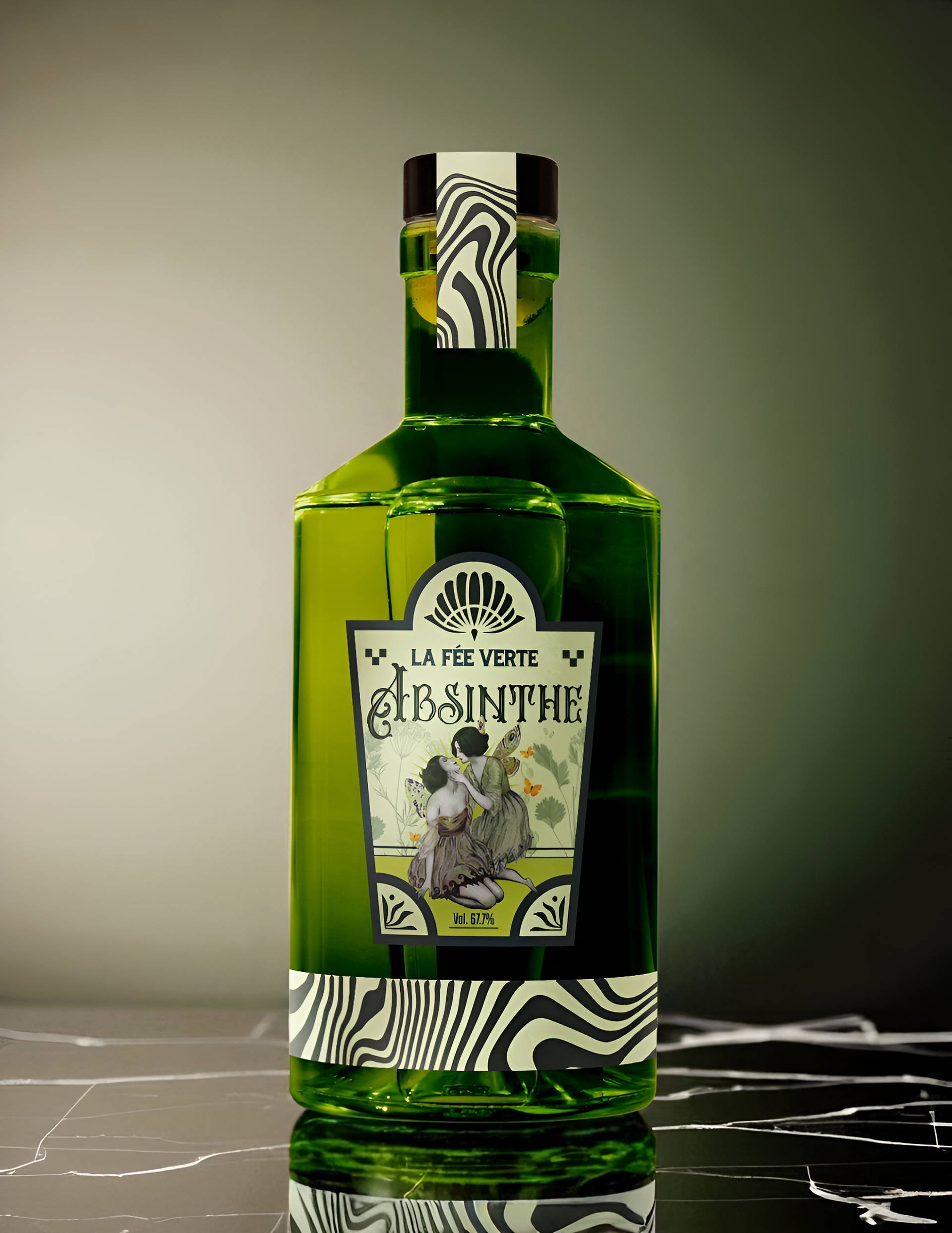
More than just a bottle, an experience.
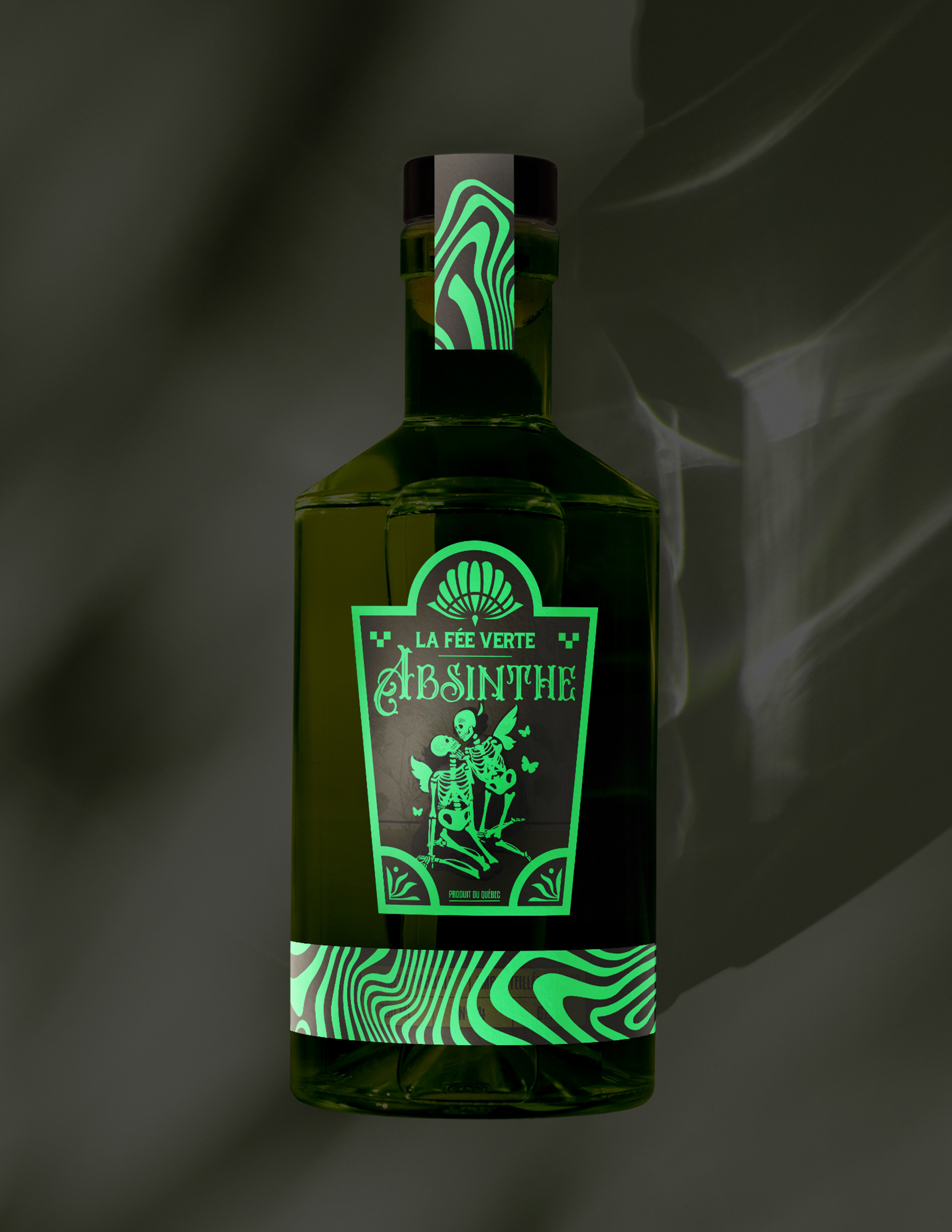
More than just a bottle, this design invites you into an experience. From its glow-in-the-dark features to the intricate nods to absinthe’s mystique, every detail is crafted to immerse the viewer before the first sip is even poured. Inspired by the rituals and legends surrounding “La Fée Verte,” the packaging isn’t simply visual; it’s atmospheric. It blurs the line between object and story, creating a moment that lingers long after the lights go out.
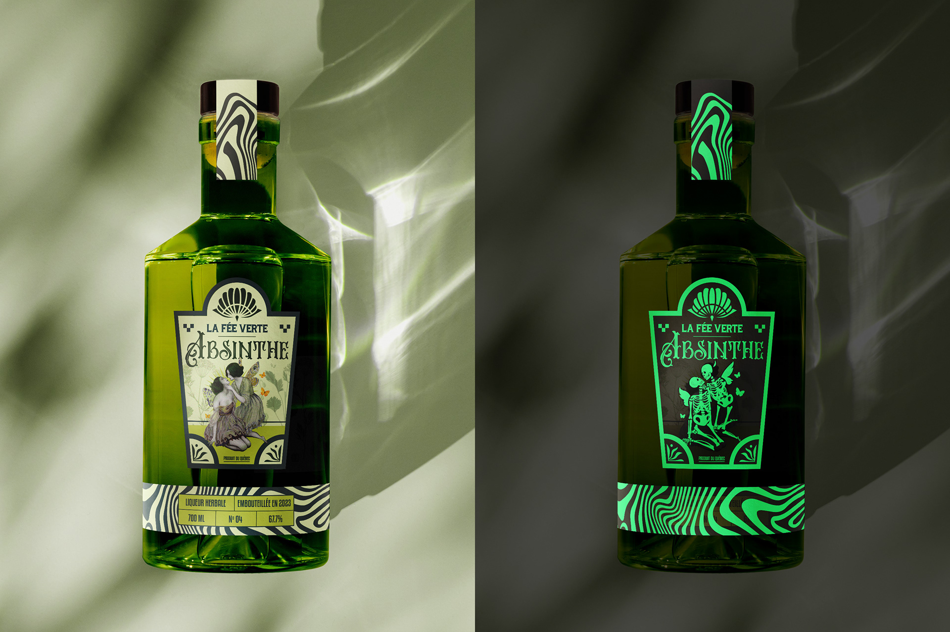
When the Lights Go Out, the Magic Begins
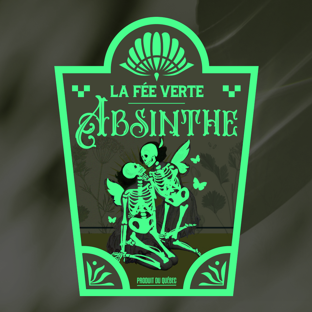
When the lights go out, the magic begins. As the bottle fades into darkness, delicate fairies reveal their true form as skeletons, echoing absinthe’s eerie past and its once-feared effects. The glow-in-the-dark design captures the hallucinatory aura that surrounded the drink, evoking a time when it was consumed in secret, hidden from view. Both psychedelic and symbolic, the packaging becomes a quiet nod to mystery, ritual, and the blurred line between fantasy and danger.
The Finished Piece
More than just a bottle, this design invites you into an experience. From its glow-in-the-dark features to the intricate nods to absinthe’s mystique, every detail is crafted to immerse the viewer before the first sip is even poured. Inspired by the rituals and legends surrounding “La Fée Verte,” the packaging isn’t simply visual; it’s atmospheric. It blurs the line between object and story, creating a moment that lingers long after the lights go out.
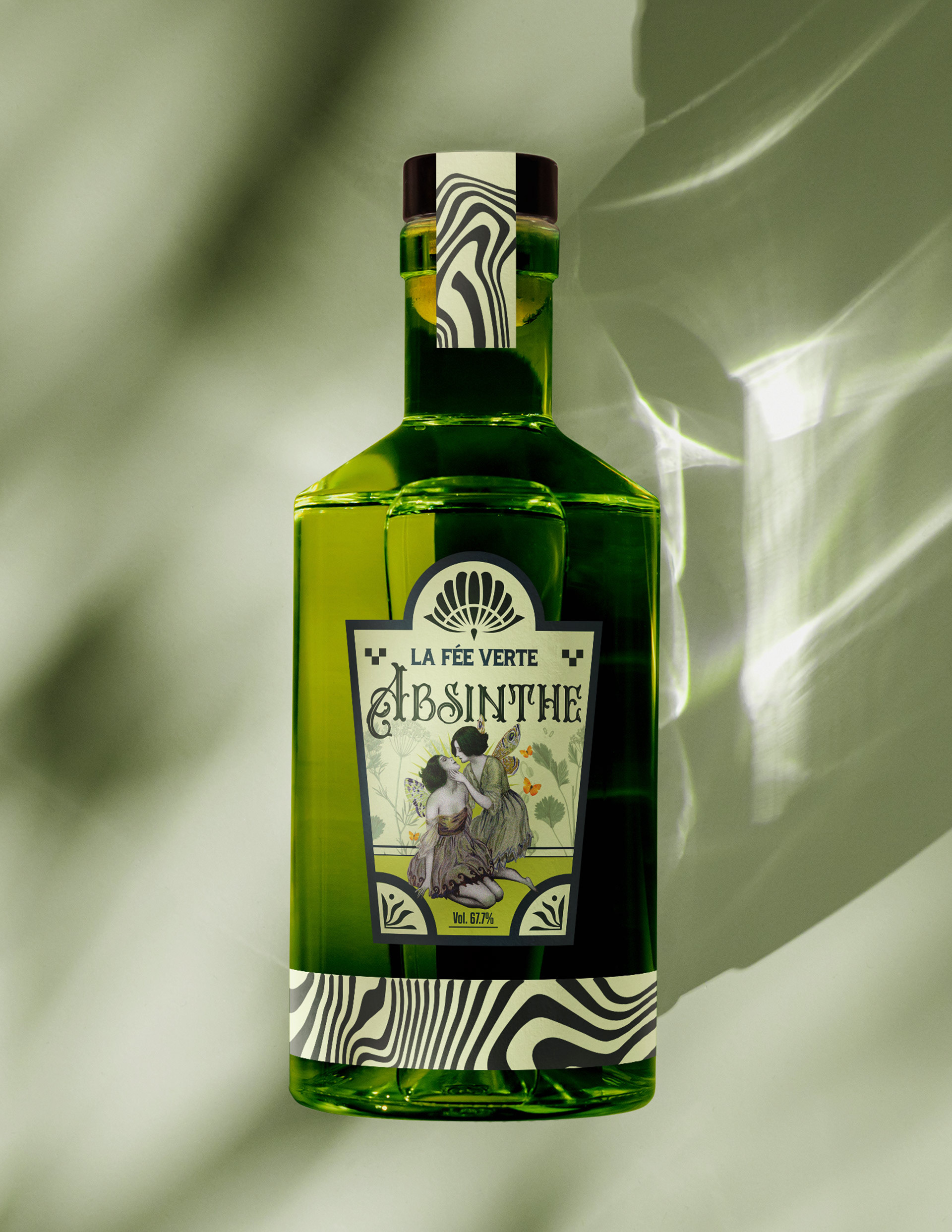
The Art of Labelling
The label features a reimagined vintage illustration, originally sourced from a free-rights archive. I carefully adapted the artwork using bold colors, layered textures, and subtle distressing to strike a balance between modern vibrancy and old-world charm. The result is a visual language that feels both nostalgic and current. It honors absinthe’s rich history while presenting it through a fresh, contemporary lens.
Layering Life and Death
The skeletons overlaying the fairies were meticulously crafted with careful attention to anatomical detail. Drawing inspiration from 3D skeleton models and photographic references, I studied bone structure and form to ensure accuracy and realism. This research-driven approach allowed the skeletons to seamlessly integrate with the whimsical fairies beneath, creating a compelling contrast between life and death. The delicate layering highlights the eerie duality at the heart of absinthe’s mystique, blending fantasy with subtle realism.
Where light fades, mystery begins
As the lights dim, the bottle transforms. Its glow-in-the-dark elements illuminate the hidden world beneath the surface. Delicate fairies shift into haunting skeletons, reflecting absinthe’s dark history and the hallucinations once associated with the drink. This design doesn’t just catch the eye. It tells a story of secrecy and mystique, inviting you to step into a ritual where light fades and imagination takes over. The packaging becomes more than a container. It’s an experience that lingers long after the bottle is empty.
Like what you see? Let’s collaborate!